CoWrks
Co-working Space
Rebranding
Cowrks is one of the largest coworking space brands in India. Within a period of 12 months, they were set to open more than 15 centers across 6 cities. With the arrival of global brands in India, they needed to have a bold presence that stood apart in the industry. Their existing typemark logo was non-cohesive and along with inconsistent visual language in place, brand recall was difficult.
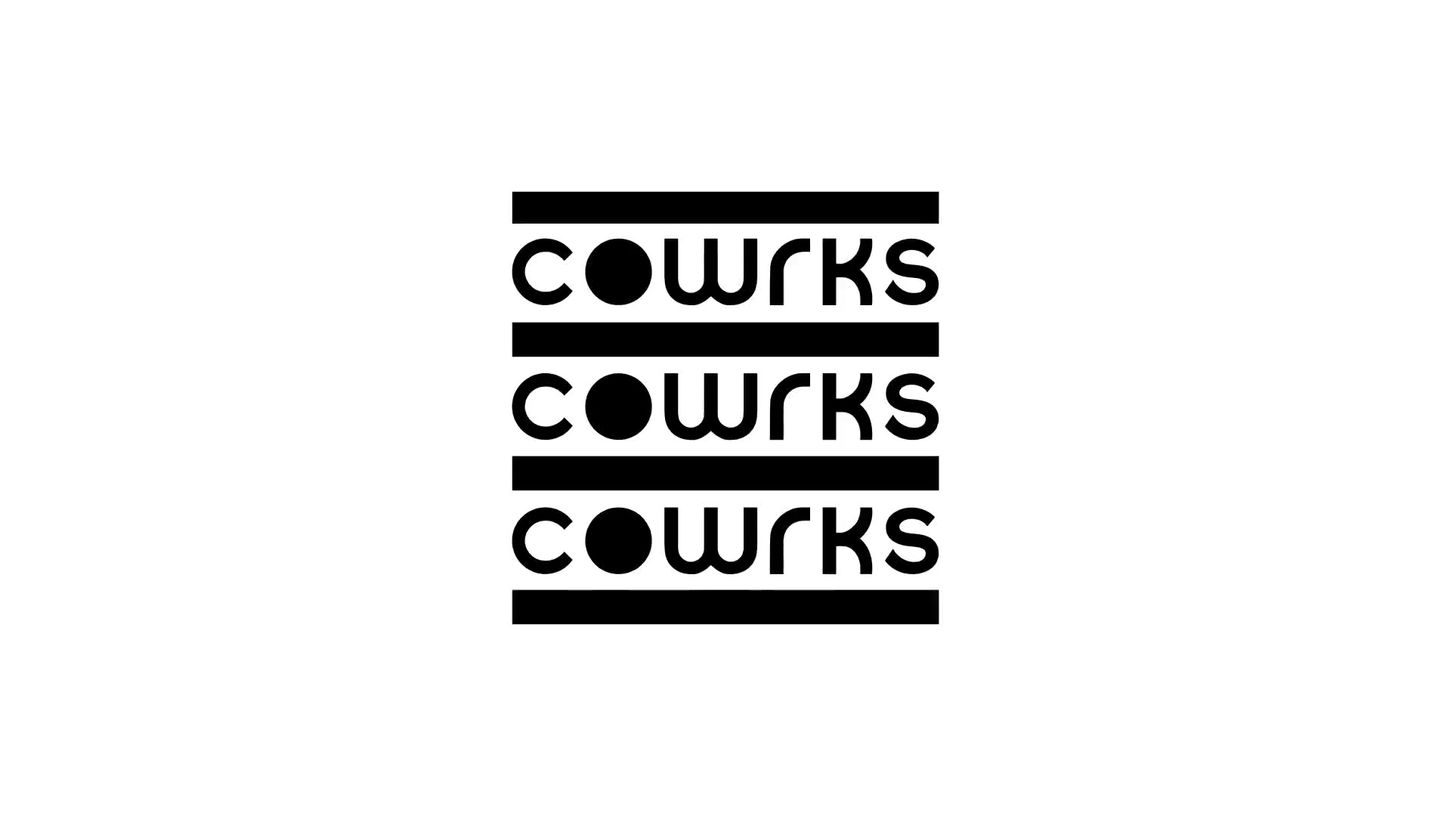
After a thorough competitor analysis and research, the typemark got a contemporary refresh and became the starting point for a flexible identity system and visual language. Rather than sitting obligingly in a corner like conventional logos, the Cowrks identity pushed the envelope of how a logo could be used. The typemark and the pattern derived out of its repetition provide a distinctive, memorable and cohesive framework for the brand applications. The typemark pattern can be used in dozens of different configurations, creating fresh extensions of the brand while reiterating the core aesthetic.

Typemark Logo rework
Layout and usage of the Logomark
Iconography
Illustration Style
Digital Application
Print Application
Stationary Application
Rebrand Reel
All credits and rights for this project lies with Opposite HQ (formerly Beard Design Co.)


